Introduction
In the fast-paced world of app development, providing users with a seamless experience across various devices and screen sizes is paramount. Flutter, Google's UI toolkit, offers an array of tools and techniques to achieve responsive design. In this article, we'll delve into the world of responsive UI design in Flutter, exploring its principles, best practices, and implementation strategies.
Understanding Responsive UI Design
Responsive UI design revolves around crafting interfaces that adapt gracefully to different screen sizes and orientations. The goal is to ensure an optimal user experience regardless of whether the app is accessed on a small smartphone, a tablet, or a desktop computer. Flutter's responsive capabilities stem from its flexible layout system and widgets, making it a powerful choice for creating cross-platform apps.

Key Concepts of Responsive UI Design in Flutter
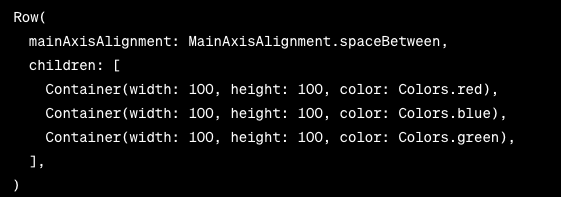
Layouts and Widgets: Flutter's foundation lies in its widget-based architecture. Utilizing widgets like Row, Column, and Flex allows developers to create dynamic layouts that adjust to different screen dimensions. These widgets enable the distribution of space, alignment, and sizing in a responsive manner.
MediaQuery: The MediaQuery class provides essential information about the device's screen size and orientation. By querying its properties, such as size and orientation, developers can make informed decisions about how to structure their UI components.


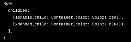
Flexible and Expanded Widgets: Flexible and Expanded widgets are instrumental in creating flexible layouts. By wrapping widgets within these containers, developers can ensure that UI elements expand or shrink according to the available space, which is particularly useful in handling various screen sizes.
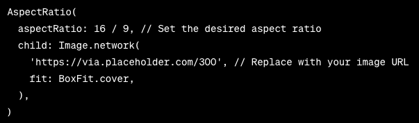
AspectRatio Widget: To maintain the aspect ratio of UI components, the AspectRatio widget can be used. This is particularly helpful when dealing with images or video elements that should retain their original proportions.
Best Practices for Implementing Responsive UI Design
- Use Constraints and Flexible Widgets: Combine ConstrainedBox and Flexible widgets to establish minimum and maximum constraints for UI components. This ensures that your layout adapts within defined limits.
- Leverage MediaQuery: Make use of the MediaQuery class to retrieve information about the screen size and orientation. This data will help you decide how your UI components should be organized.
- Create Breakpoints: Establish breakpoints based on screen width to adapt your UI layout. Use conditional logic to rearrange or resize widgets when the screen crosses these breakpoints.
- Test on Different Devices: Regularly test your app on various devices with distinct screen sizes and orientations. Flutter's hot reload feature makes this process efficient and iterative.
- Modularize UI Components: Build your UI using modular components. This enables you to swap out specific parts of the UI based on screen dimensions without rewriting large portions of cod
Introducing the responsive_framework Plugin
The responsive_framework plugin is a versatile tool that simplifies the creation of responsive UIs in Flutter. Its core functionality revolves around breakpoints, layout management, and widget resizing, ensuring your app looks and functions optimally across an array of devices.
Key Features and Concepts
- Breakpoints: Breakpoints define specific screen widths at which your UI layout adapts. These breakpoints serve as transition points where the UI components are rearranged or resized to ensure a seamless experience. The plugin's default breakpoints cover common device categories like mobile, tablet, and desktop.
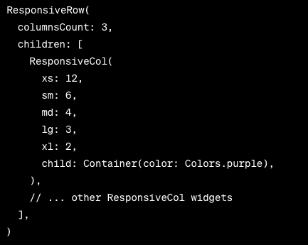
- Responsive Sizing: With the responsive_framework, sizing widgets become dynamic and intuitive. The plugin introduces responsive variants of commonly used widgets, such as ResponsiveRow and ResponsiveColumn that automatically adjust based on the current screen width.
- Layout Management: The plugin's layout management system streamlines the process of managing UI layouts at different breakpoints. You can define layout structures that change based on the screen's width, ensuring your UI remains harmonious.

Implementing Responsive Design with responsive_framework
- Installation: Begin by adding the responsive_framework dependency to your pubspec.yaml file. Then, import the package into your Dart files.
- Configuration: Configure the responsive framework by setting up your breakpoints, specifying responsive layouts, and selecting the desired alignment and distribution for your widgets.
- Responsive Widgets: Utilize the plugin's responsive widgets like ResponsiveRow and ResponsiveColumn in your layout design. These widgets adapt their arrangement and sizing according to the screen width.
- Breakpoint-Specific Components: For advanced responsiveness, define widgets that only appear at specific breakpoints. This allows you to customize the user experience for various devices.
Advantages of Using the responsive_framework Plugin
- Efficiency: The plugin streamlines the process of designing responsive UIs, saving developers time and effort.
- Consistency: UI components remain consistent across different devices, enhancing the user experience.
- Readability: The plugin's structured approach enhances code readability and maintainability, even as the UI becomes more complex.
Conclusion
Responsive UI design in Flutter is a fundamental aspect of creating user-friendly apps that cater to diverse devices and user preferences. Flutter's comprehensive toolkit empowers developers to craft interfaces that adapt fluidly to changing screen sizes and orientations.
The responsive_framework plugin further enhances the responsive design process by offering breakpoints, responsive widgets, and a layout management system that simplifies the creation of adaptable interfaces. Embracing tools like responsive_framework as Flutter evolves allows developers to unleash the potential of creating captivating applications that excel on every screen, ensuring users can engage with your app comfortably and effectively.
By understanding the principles of responsive design and employing best practices, you can ensure that your Flutter apps provide a consistent and delightful experience for users across the board. So, if you need assistance with responsive design in Flutter, you are at the right place. Hire Flutter Developers from Your Team in India and get your highly responsive apps built with us.


 4.8 out of 5 by